
One of the more interesting ways to look at data is to use machine learning to sort your data into clusters. The particular tool I used for this is called K-Means Clustering, a popular algorithm in the field of data science for its simplicity and efficiency. But what exactly is K-Means Clustering? At its core, K-Means is a method that aims to partition a dataset into distinct groups (clusters) such that the data points in each group are as similar to each other as possible, while also being as different as possible from the points in other groups.
Why is this approach useful? We often deal with large amounts of data that can seem impenetrable at first glance. By organizing this data into clusters, we can identify patterns and characteristics that are not obvious to us at first. For instance, when we analyze schools across various districts, K-Means Clustering can reveal groupings of schools with similar challenges or successes, helping us to tailor support and resources more effectively.
For this analysis, I wanted to look closer at Overall Success Rate, Economically Disadvantaged Percentage, and Black/Hispanic/Native American percentage using the same dataset I used for my initial Letter Grades report. I reduced the dataset to those three features, and I had to convert the values in the Success Rate column from <5% to 2.5 and >95% to 97.5 and the convert those values to floats.
Here are the basic descriptive statistics.

Descriptive Statistics
Here is how the data is distributed.

Histograms of each feature
The Success Rate histogram shows a unimodal distribution centered around 30-40%. The distribution is slightly skewed to the right, indicating that while most schools have a success rate in the middle range, there are fewer schools with very high success rates.
The distribution of the percentage of economically disadvantaged students is also unimodal and seems to be slightly skewed to the right. Most schools have between 20% to 40% economically disadvantaged students, with fewer schools having very high or very low percentages.
The BHN histogram is different from the other two, showing a bimodal distribution. One peak is around the 0-10% range, and another, more pronounced peak, is at the 90-100% range. This suggests that schools tend to have either a very low or very high percentage of Black, Hispanic, or Native American students, with fewer schools having a moderate percentage. This histogram supports Kozol’s research that American schools are still segregated.
Next, I wanted to see how each of these values correlated. I did scatterplots and ran a Pearson’s r to see the relationships between the data.

Scatterplots and Pearson’s r correlation coefficients
No surprise, but the data shows the following:
Success Rate vs. Economically Disadvantaged: The correlation coefficient is -0.72, indicating a strong negative correlation. This means that as the percentage of economically disadvantaged students increases, the overall success rate tends to decrease.
Success Rate vs. BHN: The correlation coefficient is -0.56, suggesting a moderate negative correlation. So, higher percentages of BHN students are associated with lower overall success rates.
Economically Disadvantaged vs. BHN: The correlation coefficient is 0.61, showing a strong positive correlation. This implies that higher percentages of economically disadvantaged students are often found in schools with higher percentages of BHN students.
The Clustering Model
Before running the model, I scaled the data using the standard scaler. This is crucial for K-Means Clustering. Here is an article about that if you want to read it. And of course, I ran an elbow plot to find the optimal number of clusters.

The elbow plot
The elbow plot settled on five clusters. After fitting the model and running it for 5 clusters, I generated a 3D Scatterplot of the 5 clusters just to have a visual of the differences. The red star represents the centroid of the cluster.
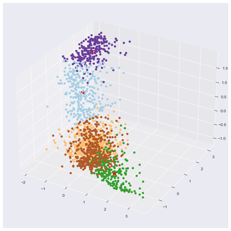
3D Scatterplot
The clusters that it generated can be described as follows:
Cluster 0 (286 schools) has a relatively low overall success rate of about 25%, a moderate percentage of economically disadvantaged students (around 38%), and a very high percentage of Black, Hispanic, or Native American students (approximately 70%).
Cluster 1 (187 schools) is characterized by a high overall success rate of around 71%, a low percentage of economically disadvantaged students (about 8%), and a lower percentage of Black, Hispanic, or Native American students (roughly 18%).
Cluster 2 (490 schools) features a low-to-moderate overall success rate of about 33%, a moderate percentage of economically disadvantaged students (also around 38%), but a lower percentage of Black, Hispanic, or Native American students (about 12.5%).
Cluster 3 (231 schools) has the lowest overall success rate of approximately 15%, the highest percentage of economically disadvantaged students (around 66%), and a very high percentage of Black, Hispanic, or Native American students (nearly 95%).
Cluster 4 (476 schools) shows a moderate overall success rate of around 45%, with a lower percentage of economically disadvantaged students (about 21%) and a percentage of Black, Hispanic, or Native American students similar to the previous value (around 21%).
Here is a bar chart showing the Cluster Profiles.

A bar chart of each cluster
And to illustrate how many schools are represented in each cluster, here is a humble pie-chart.

Conclusions
Diversity in School Profiles: The clusters represent a wide range of school profiles, from those with high success rates and low percentages of economically disadvantaged and minority students (Cluster 1) to those facing significant challenges with high percentages of disadvantaged and minority students and low success rates (Cluster 3).
Economic Disadvantage and Success Rates: There appears to be a correlation between economic disadvantage and overall success rates, as seen in the negative correlation coefficients and the cluster characteristics. Schools with a higher percentage of economically disadvantaged students tend to have lower overall success rates (Cluster 0 and Cluster 3).
Racial and Economic Segregation: The bimodal distribution of the percentage of Black, Hispanic, and Native American students indicates potential racial and economic segregation within the school system. Some schools have very high percentages of minority students, while others have very low percentages, with fewer schools in between.
Most Schools Do Not Have a High Success Rates: Cluster 4 and Cluster 1 schools have high success rates. Typically, 45% is the bar schools want to reach because that represents maximum points in the federal accountability model for success rate. These only represent 39.6% of all schools. This means that 60.4% of all schools are falling below that mark.
Cluster 4 stands out
Cluster 4 stands out as a cluster with some diversity and high success rate. The means for Economically Disadvantaged (20.99) and BHN (21.24) are still much lower than the overall means for those categories.
What do you see in this data?