I Can Predict Your School's Achievement Without Looking at a Single Test Score
A machine learning analysis of roughly 1,700 Tennessee public schools across two years, comparing what letter grades tell us versus what they hide.
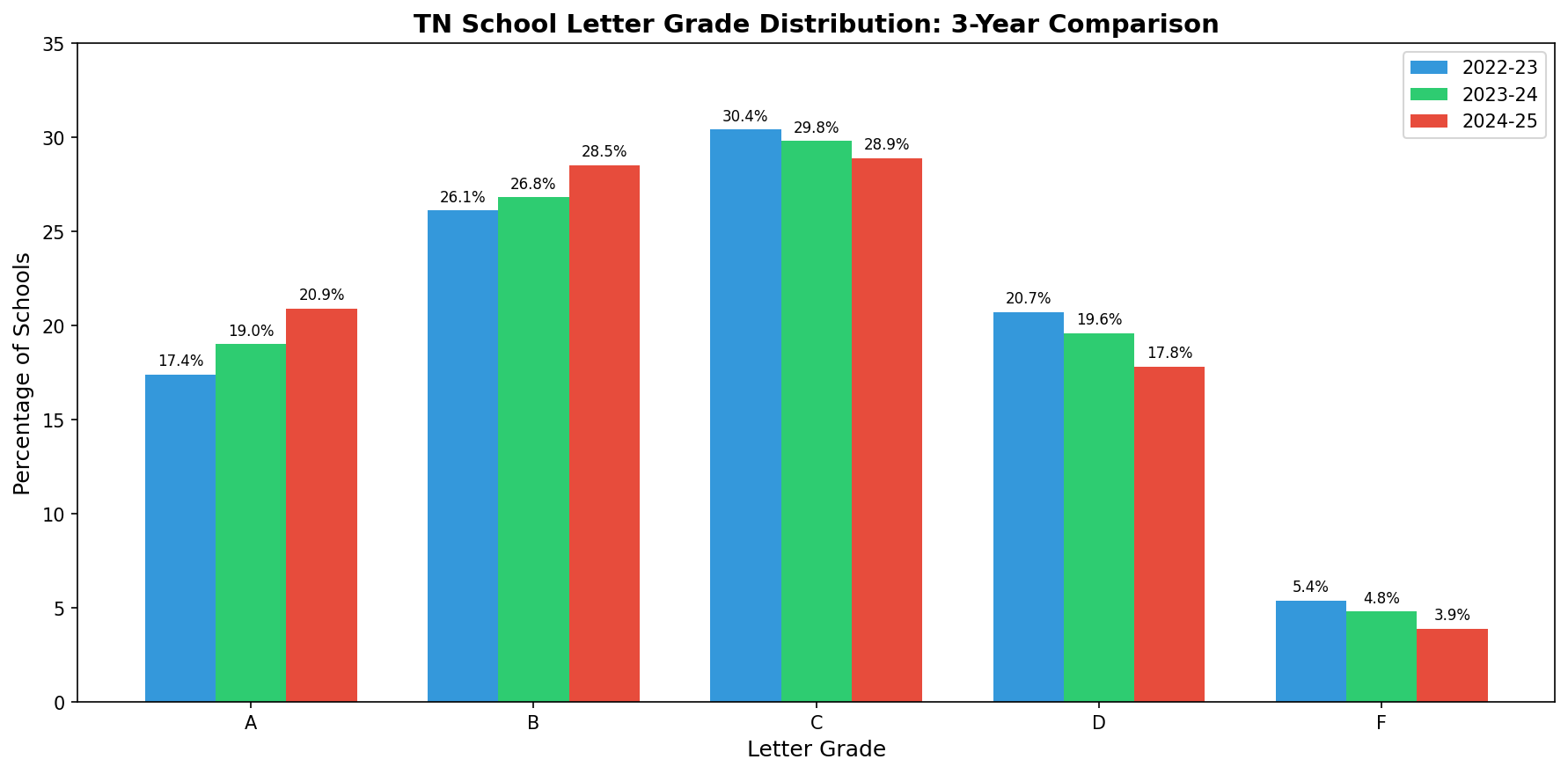
Tennessee gives every public school a letter grade. A through F, just like report cards. The state calculates it from a formula that weighs achievement scores, growth, chronic absenteeism, English learner progress, and for high schools, graduation rates and college/career readiness.
The formula is public. If you know a school's test scores, you can basically calculate the grade yourself. Which raises a question I've been chewing on: what if you strip out all the test-based inputs and just look at the structural stuff, the demographics, staffing, funding, discipline rates, the conditions a school operates under? How much can you predict?
The answer surprised me.
The Experiment
I pulled every publicly available dataset from the Tennessee Department of Education for the 2022-23 and 2023-24 school years: letter grades, school profiles, chronic absenteeism, discipline, educator experience, teacher retention, staffing ratios, per-pupil expenditures, funding sources, graduation rates, and dropout rates. Merged them all at the school level. About 1,690 eligible schools per year, observed across both years for 3,381 school-year observations.
Then I deliberately removed every variable that directly feeds Tennessee's letter grade formula. No achievement scores, no growth scores, no success rates, no CCR rates. What remained were 33 contextual features: things like percent economically disadvantaged, chronic absenteeism, teacher retention, per-pupil spending, and demographic composition.
I ran the analysis two ways. First, I tried to classify the letter grade itself (A through F). Then I switched the target to overall success rate, the continuous achievement percentage that drives the letter grade. Same features, different targets. The comparison is telling.
Round 1: Predicting the Letter Grade
Five models. Random Forest, XGBoost, Gradient Boosting, Logistic Regression, and an Ordinal Logistic model that respects the A > B > C > D > F ordering. Best accuracy across the board: about 40%.
| Model |
Accuracy |
CV Accuracy |
Mean Absolute Error |
| Logistic Regression |
41.8% |
39.9% |
0.73 grades |
| Ordinal Logistic |
41.4% |
40.1% |
0.74 grades |
| Random Forest |
40.2% |
40.3% |
0.75 grades |
| XGBoost |
34.4% |
40.6% |
0.83 grades |
| Gradient Boosting |
37.1% |
39.6% |
0.79 grades |
40% accuracy across five categories is better than random (20%), but not great. The models were off by about 0.75 letter grades on average. If a school is a C, the model might guess B or D. Close, but noisy.
The letter grade bins are doing real damage here. A school with a 49% success rate and a school with a 51% success rate might land in different grade buckets, but structurally they're nearly identical. The model sees the same features and reasonably groups them together, but the grading system draws an arbitrary line between them.
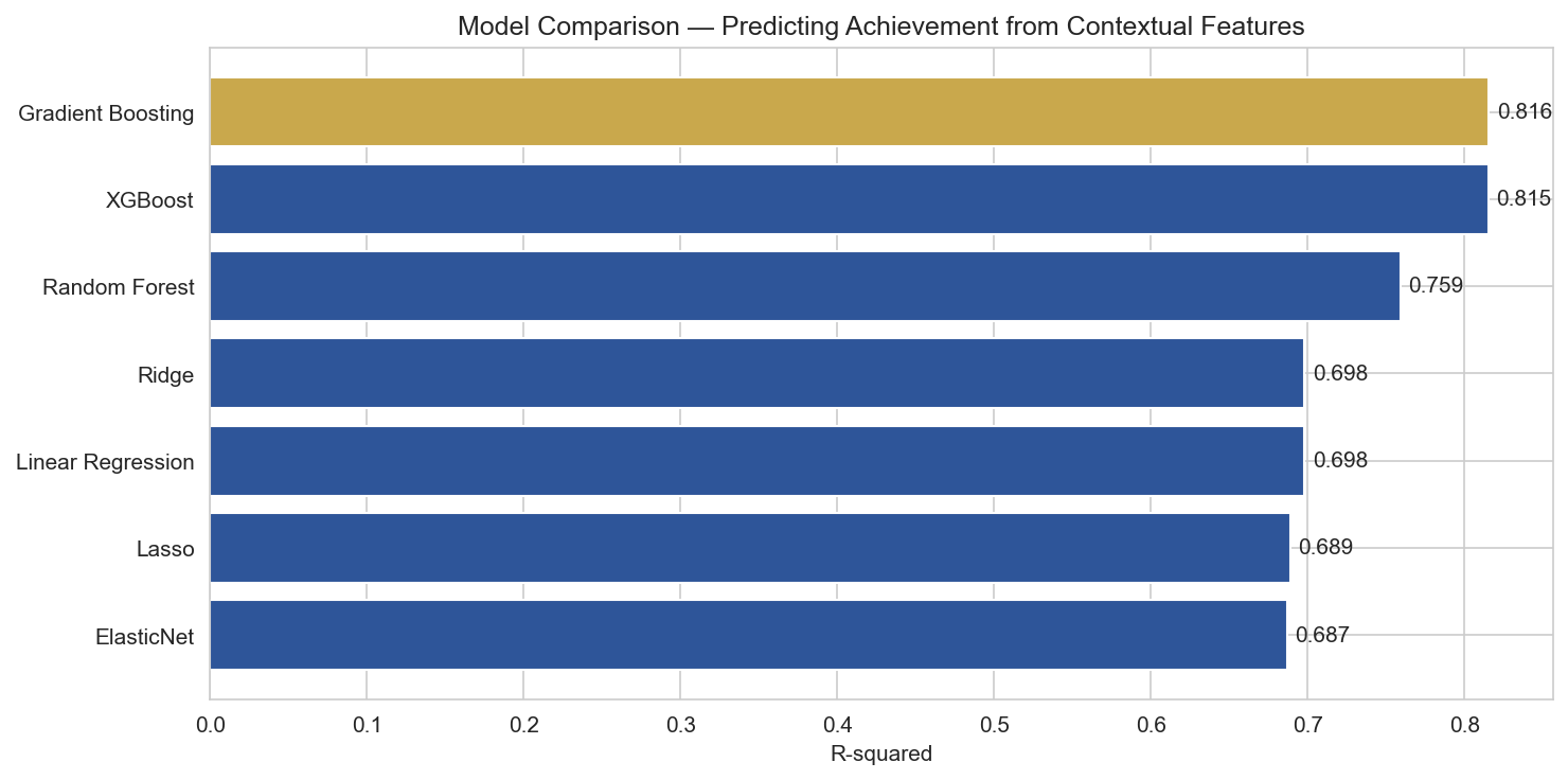
Round 2: Predicting Achievement Directly
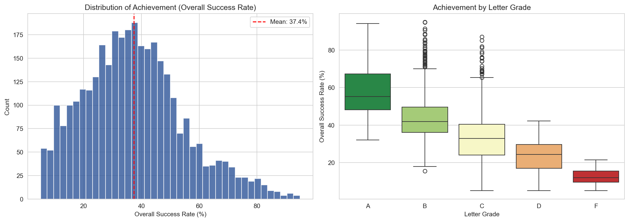
Same 33 contextual features. Same schools. But instead of predicting A/B/C/D/F, I targeted the overall success rate, a continuous percentage from 5% to 95%.
| Model |
R-squared |
Mean Absolute Error |
CV R-squared |
| XGBoost (Tuned) |
0.823 |
5.5 pct pts |
— |
| Gradient Boosting |
0.816 |
5.6 pct pts |
0.819 |
| XGBoost |
0.815 |
5.7 pct pts |
0.822 |
| Random Forest |
0.759 |
6.4 pct pts |
0.783 |
| Ridge Regression |
0.698 |
7.2 pct pts |
0.663 |
| Linear Regression |
0.698 |
7.2 pct pts |
0.615 |
| Lasso |
0.689 |
7.3 pct pts |
0.661 |
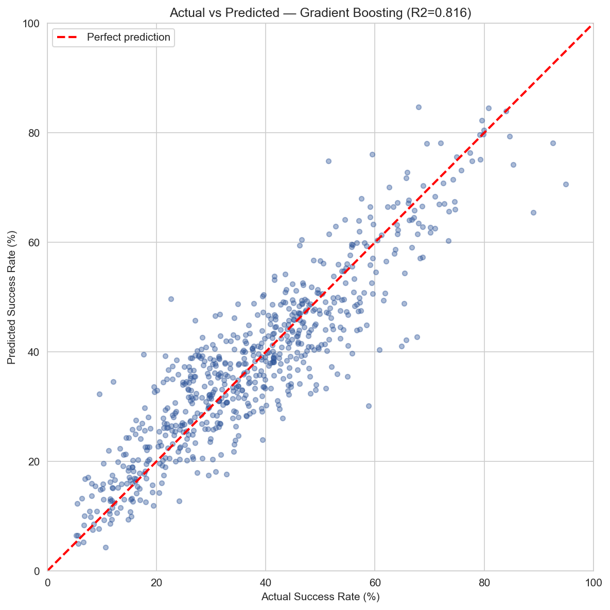
R² = 0.82
Contextual features alone explain 82% of the variance in school achievement. No test scores needed.
±5.5 pts
The tuned model predicts a school's success rate within 5.5 percentage points on average.
That is a massive jump. The same features that could only guess a letter grade 40% of the time can explain 82% of the variance in achievement when you let the model see the actual number instead of a bucketed label.
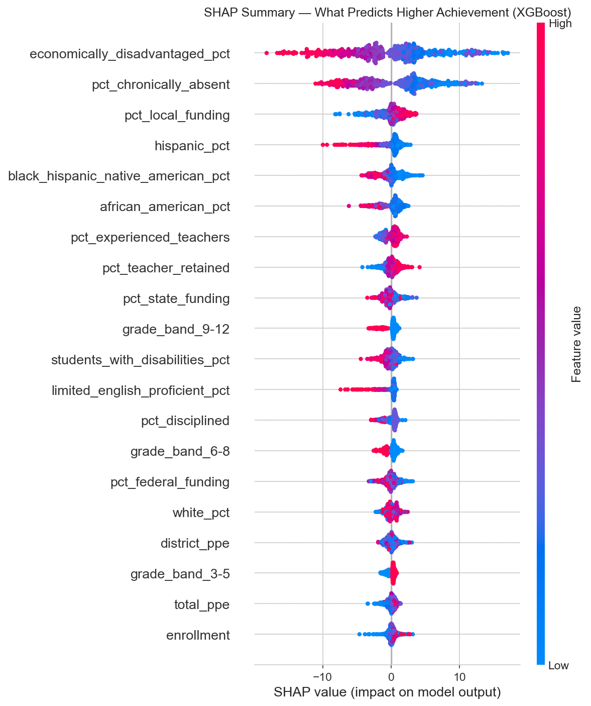
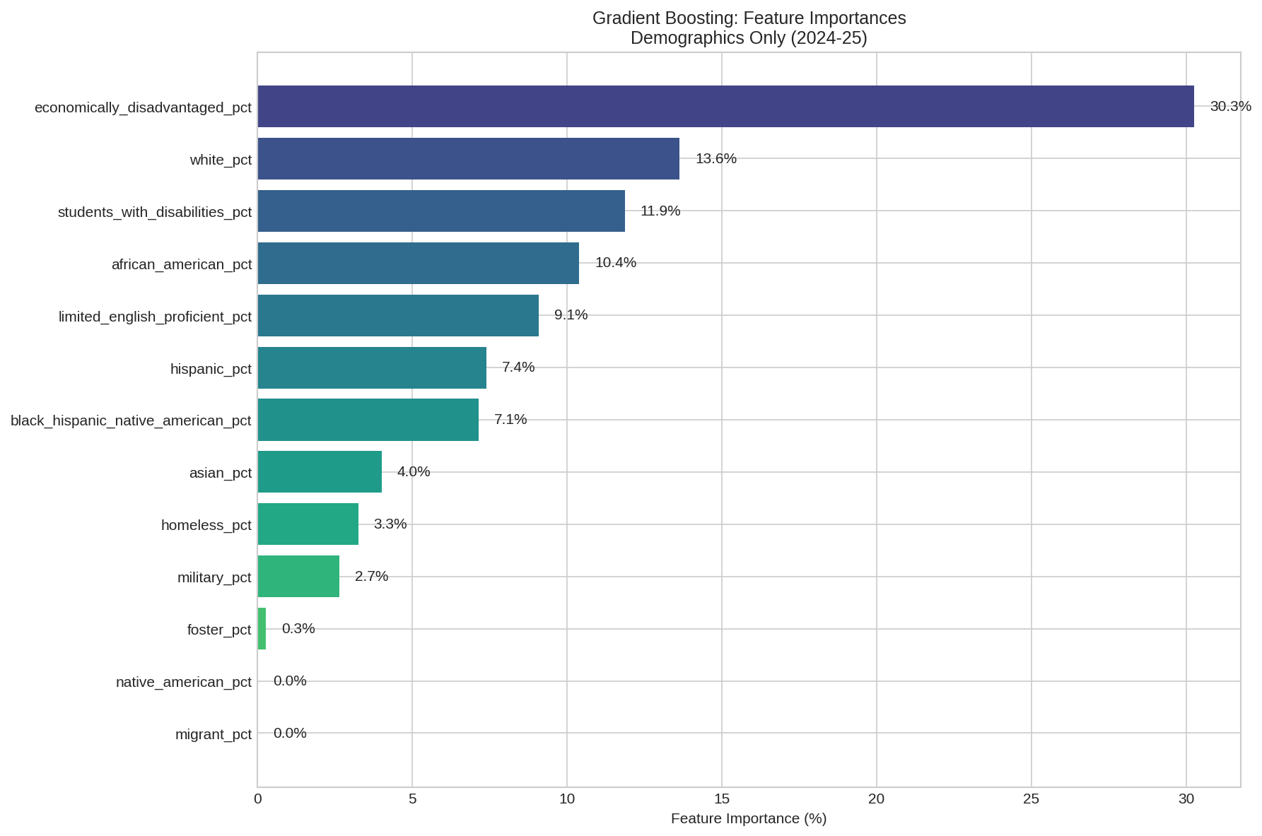
What Drives Achievement
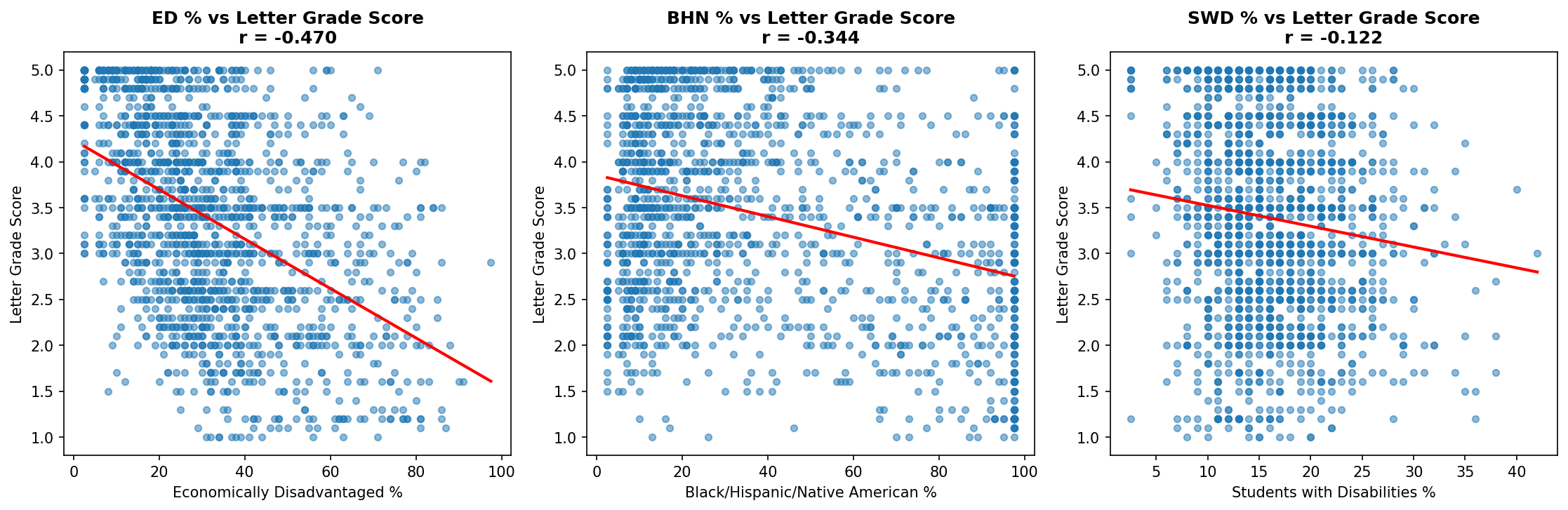
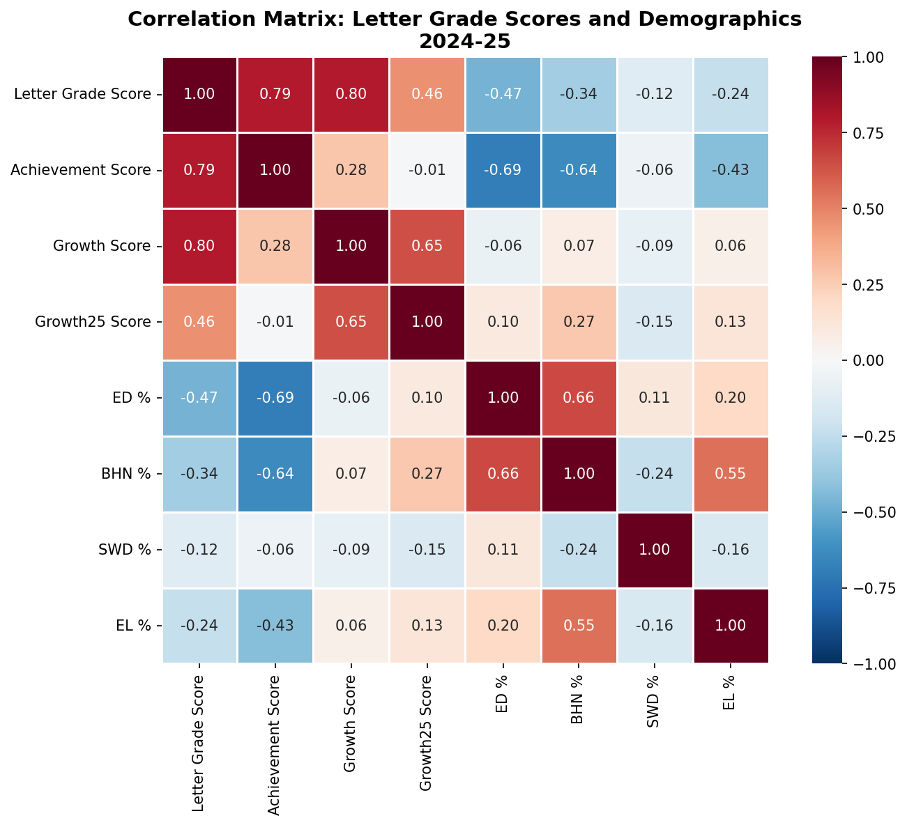
SHAP (SHapley Additive exPlanations) tells us not just which features matter, but how much they move the needle and in which direction. The units here are percentage points of achievement.
Two features tower over the rest:
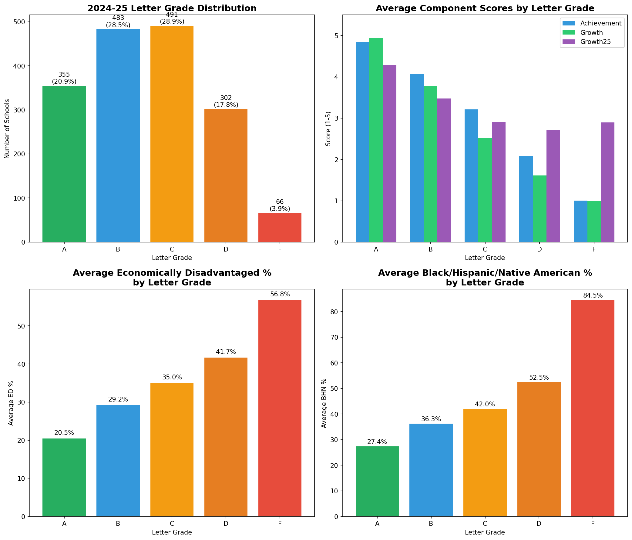
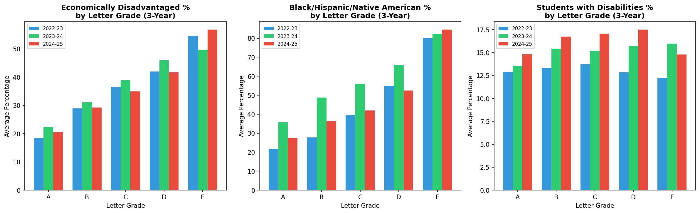
- Economically disadvantaged percentage: 5.3 points of influence on average. Higher poverty, lower achievement.
- Chronic absenteeism: 4.7 points of influence. More absent students, lower achievement.
After those two, a cluster of second-tier features emerges: local funding percentage (positive), demographic composition, experienced teachers (positive), teacher retention (positive), and discipline rates (negative). Each of these contributes roughly 0.6 to 1.3 percentage points.
Look at that SHAP summary. High economically disadvantaged percentage (red dots) consistently pushes predictions left (lower achievement). High chronic absenteeism does the same. High local funding and experienced teacher percentages push right (higher achievement). The patterns are clear and consistent.
Why the Comparison Matters
The letter grade classification flopped not because the features lack signal, but because the grading system collapses a continuous reality into five bins. A school at the 49th percentile and a school at the 51st percentile might be structurally identical, but one gets a C and the other a B. The model can't distinguish them because there's nothing structurally distinguishing to find.
When you let the model predict the actual achievement percentage, it stops fighting artificial boundaries and starts learning the real relationship between conditions and outcomes. The same data that produced a mediocre 40% classifier produces an R-squared of 0.82 when you ask the right question.
This is a data science lesson wrapped in education policy. If your outcome variable is discretized from something continuous, you're throwing away information. The letter grade system takes a rich, nuanced distribution of achievement and flattens it into a handful of buckets.
A Case Study: Greeneville City Schools
I work for Greeneville City Schools, so I ran our numbers through the same lens. The model says poverty and absenteeism explain 82% of achievement. GCS has a district-wide economically disadvantaged rate around 29%, which puts us in the middle of the pack. Based on structural factors alone, the model would predict us to land somewhere around the state average.
We don't.
+8.1 pts
In 2023-24, GCS scored 8.1 percentage points above the expected achievement for districts with our demographic profile, nearly double the 4.2-point gap from the year before.
15th of 98
Among districts with similar ED populations, GCS ranked 15th in achievement in 2023-24, up from 26th the year prior.
In 2023-24, four of our seven schools earned A grades. Here's every GCS school, year over year:
| School |
ED % |
2022-23 |
2023-24 |
Change |
| Eastview Elementary |
18% |
56.9% (A) |
61.2% (A) |
+4.3 pts |
| Tusculum View Elementary |
27% |
41.8% (B) |
50.0% (A) |
+8.2 pts |
| Greeneville High School |
24% |
50.0% (A) |
48.4% (A) |
-1.6 pts |
| Greeneville Middle School |
24% |
44.9% (B) |
47.8% (A) |
+2.9 pts |
| Hal Henard Elementary |
36% |
49.7% (B) |
48.3% (C) |
-1.4 pts |
| Highland Elementary |
54% |
32.6% (C) |
36.5% (C) |
+3.9 pts |
| TOPS Greeneville |
17% |
29.1% (D) |
37.5% (C) |
+8.4 pts |
Five of seven schools improved, several significantly. Tusculum View jumped from a B to an A with an 8.2-point gain. TOPS Greeneville climbed 8.4 points and moved from a D to a C. Even Highland Elementary, our highest-poverty school at 54% ED, scored 36.5%, well above the 24% state average for schools in that ED range. Highland ranks 13th out of 131 schools with similar poverty levels statewide.
The model says schools like ours should perform at a certain level given our demographics. We keep outperforming that prediction, and the gap is widening. That's not an accident. That's what happens when experienced teachers stay (we have strong retention), absenteeism is managed, and the district invests in the things that actually move the needle.
What This Means for Districts
If you run a school district in Tennessee, here is what 1,700 schools, two years of data, and seven models are telling you:
- Your letter grade is 82% predictable from factors that have nothing to do with how well you teach. Poverty and absenteeism alone account for most of the variance.
- The two highest-leverage things a district can invest in are reducing chronic absenteeism and supporting economically disadvantaged students. Everything else is a rounding error by comparison.
- Teacher experience and retention matter, but they're second-tier effects. A school with great teachers in a high-poverty, high-absenteeism context will still struggle on paper.
- Spending more money per pupil, counterintuitively, correlates negatively with achievement. This isn't because money hurts. It's because Title I funding flows to the schools that need it most, and need is correlated with the same factors that drag down scores.
None of this is new to anyone who runs schools. We all know poverty predicts outcomes. But there's a difference between knowing it and seeing a machine learning model explain 82% of the variance with nothing but contextual features. It puts a precise number on something we've felt in our bones for years.
The uncomfortable implication: Tennessee's letter grade system is, to a large degree, grading the ZIP code. A school's structural context is doing most of the talking, and the letter grade is mostly just a noisy echo of it. But districts like Greeneville show it doesn't have to be destiny. The 18% of variance the model can't explain? That's where the work happens.
Methodology Notes
Data: Tennessee Department of Education public data downloads for 2022-23 and 2023-24. All school-level. Schools flagged as ineligible for letter grades were excluded. Approximately 1,690 unique schools observed across both years, yielding 3,381 school-year observations (3,345 with valid achievement data).
Features: 33 contextual variables across demographics, teacher quality, discipline, absenteeism, finance, staffing, graduation, and dropout. All formula-input features (achievement scores, growth scores, success rates, CCR rates) were deliberately excluded.
Models: Seven regression models (Linear, Ridge, Lasso, ElasticNet, Random Forest, Gradient Boosting, XGBoost) plus hyperparameter tuning via RandomizedSearchCV. Five classification models for the letter grade comparison. 80/20 train/test split, stratified. 5-fold cross-validation on training sets.
SHAP values computed via TreeExplainer on the XGBoost regression model. All code available on request.